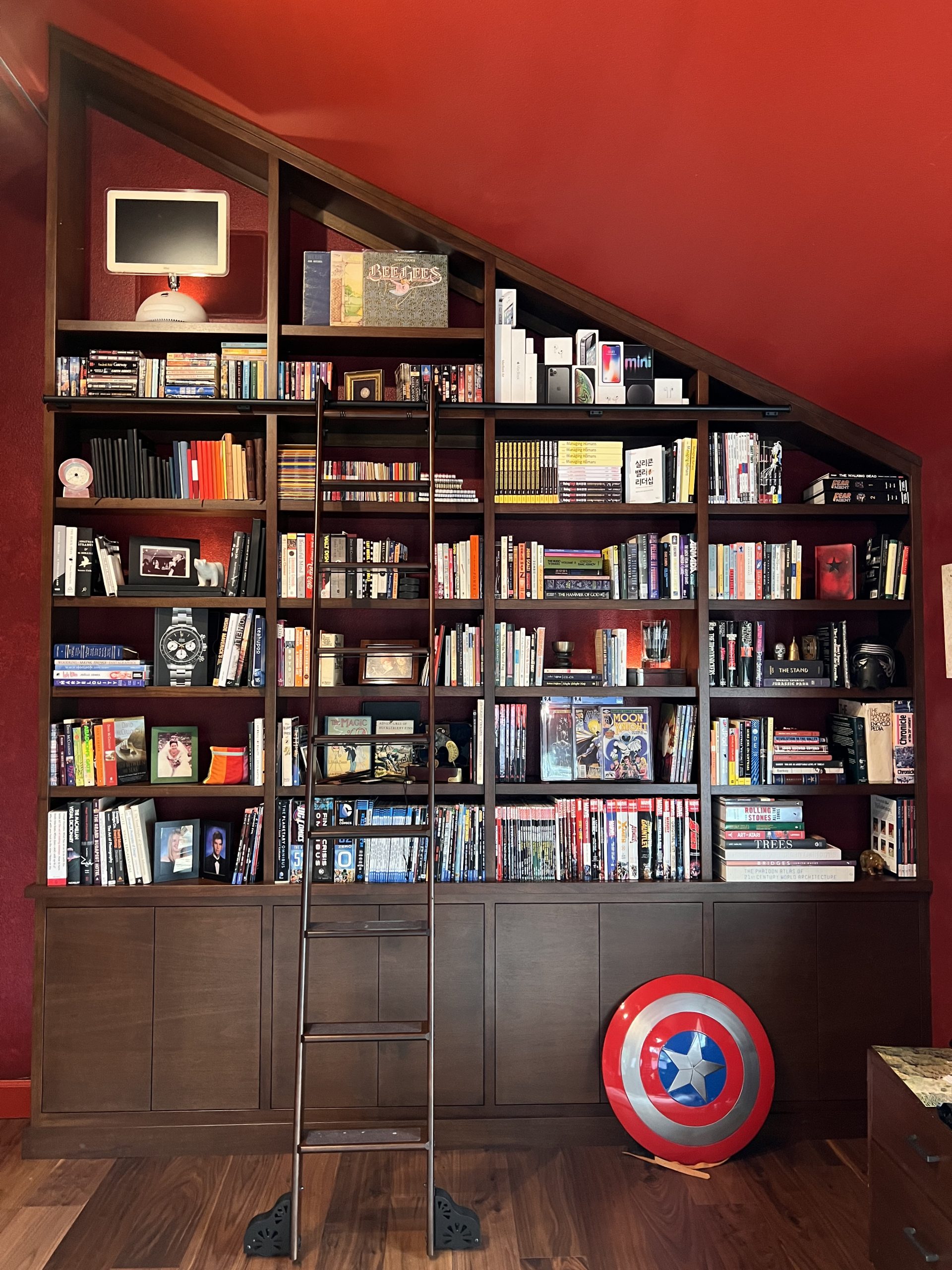
My personal weblog. No, Rands is not my real name. I use my real name as a full time engineering manager in the Silicon Valley. Yeah, that's me in the logo. I hadn't shaved in some time. My hair is longer now.

I've been writing here since April of 2002. I used to write about four significant pieces a month, but that's down to about two. Content varies from thoughts of being an engineering manager in Silicon Valley to writing to what it's like to be a nerd.
Before Rands in Repose, I wrote a weblog called The Bitsifter Digest. The site is no longer available and the articles are gathering dust on my hard drive. One of these days, I'll dig up those articles and repost them because they document an interesting time of the Internet.
Other than folks buying the book, I receive no remuneration for the writing of this site. If you find my writing useful, tell me about it. If you want to take that a step further, I suggest you check out my Amazon wish list. I think rewarding good writing with more good writing keeps the planet karmically aligned.
Joel on Software was kind enough to publish one of my essays in his Best of Software I book. You can buy the book on the publisher's site or Amazon and, no, that's not an Amazon associates link.
This site runs on whatever the latest version of Movable Type is out there. If you want to know more about Movable Type, I suggest you visit their fine site.
Over those years, many folks have been helpful/insightful with regard to the site:
» My Family. For putting up with varieties of my writing moods.
» Mike & Melle. For copy editing and design support.
» Anyone who has taken the time to leave an intelligent comment.
This is the Style Guide for the 4th generation of this site.
In June 2007, my first book entitled Managing Humans hit the book shelves. The book is being published by Apress. While much of the content originated on the weblog, every chapter has been meticulously rewritten and edited. There are some new chapters, as well.
There's a promotional website for the book which you should probably check out.
The opinions expressed on this website are entirely my own. They do not represent the strategy/plans/thoughts of my employer, my friends, my cat, or that kid who always got picked last for sports and who, right now, has a larger net worth than his entire high school.
In many of my articles, I often refer to specific people as a means of telling the story... making a point. These people do not exist -- they are fabrications that are specifically constructed to make a point. There are traits or quirks of former co-workers and friends that I borrow to construct my story persona, but these small slices of personality do not a person make.
I go out of my way to never borrow traits, ideas, or personalities from my current set of co-workers and managers. That would be bad form.
Regarding gender: I use the term he as a convenience. There are plenty of she-nerds/engineers/managers/pen-lovers out there for which all of these observations equally apply.
While free speech is encouraged at Rands in Repose, there is a comment policy because there are a lot of idiots on the planet and there is a finite probability that you might be one.
This policy reads like this: "Post whatever you like. I won't edit content or attribution of any comment. However, I'll delete whatever comment I like."
I don't delete comments willy nilly. Generally, if something is deleted, it's:
» Spam (Which should be automatically handled by Akismet)
» Off Topic
» Involves a personal attack on another
A name and an email is required to post.
April 24, 2005 (Style Guide):
I used the structure from the previous redesign for the third revision to the site. When you compare the two, you can see the similarities. Still, I felt this redesign made the site much more readable.
What worked:
Fonts and spacing. I look back at prior designs and just cringe. How in the world would any want to read the weblog with headlines shoved next to content. Yuck.
The big R. I really liked the R logo. Returning readers might've noticed I varied the background over the year and a half. I will miss the R in the new design although it lives on in the favicon for the new design.
What didn't work:
I continue to pay a tax for poor CSS design. While the site looks fine, the maintenance of the site is much harder than it need to be. This tax continue in the latest design. My layout needs a complete CSS re-do.
The right bar having no right border was supposed to look "artsy". It looked lame.
The archives page continued to be a study in lazy simplicity.
December 30, 2003:
I really was proud of the first major revision of RinR. I cleaned up the mess from the first version and created a design that scaled nicely as new ideas showed up.
What worked:
Until the last six months of the 2003, I really liked the layout of this version of the site. It was clean and readable. As I added new RSS content to the right sidebar, the appearance didn't appear to suffer.
What didn't work:
Under the hood, I tried to keep the HTML and CSS organized via templates. This fell flat on it's face during the initial design when I decided to continue to use table to organize the layout. Combined with a bizarre indentation scheme, this meant that I had table size information spread all over the place which limited the usefulness of a template strategy.
The content in the right sidebar looked just fine in Windows IE, but lacked on Mac OS X browsers. I initially tinkered with this a few months back and decided that a rewrite in CSS was necessary to get what I wanted.
Personally, I don't think the font and font size on this version of the site are that readable. This is partly due to the fact that I moved to Mac OS X and a flat panel monitor which significantly tweak my font viewage.
July 3rd, 2002:
This very first version of Rands in Repose was originally designed to be maintained by hand which meant that simplicity was an original design point. This was also my first foray into the use of CSS as a means of separation presentation from content. This separation was further beaten into me by moving the entire site into Movabletype roughly a month into the site's existence.
What worked:
Well, I hit the simplicity nail on the head. The site is easy to read. To a fault.
Under the hood, I've got decent separation of content from CSS. This was a good learning experience for completely redoing the site.
What didn't work:
The toolbar at the top of the screen, I'm certain, confused the hell out of people. The new site uses text rather than icons for access to other parts of the site. I'm a fan of icons, but as my graphical artistic abilities are suspect, I'm at the mercy of the Microsoft's Webdings.
The design does not flow. There are three separate boxes (LOGO, NAVIGATION, CONTENT) which sit there staring at each other when they should be working together. Of particular egregiousness is the LOGO area which is painfully underused. Again, I fixed this by sticking in all sorts of toys into the new LOGO area of the new site.
» B.A.B. (9)
» A Story Culture (30)
» Knee Jerks (13)
» Alex King
» Cabel.Name
» Coudal Partners
» Curved White
» Daring Fireball
» Joel on Software
» Legends of the Sun Pig
» ~stevenf
» Subtraction
» Veer
» Mail: feedback@randsinrepose.com
» Rands in RSS
» Amazon Wish List
» Flickr
» Twitter
» Forums